Studio Art Direct Wins National Award for Healthcare Art Installations

40’0” high hand crafted sculpture and (11) hand painted wallpapers were designed by Studio Art Direct’s founder, Janelle Baglien, specifically for this 90,000 SF Kaiser permanente medical office building.

40’0” high hand crafted sculpture and (11) hand painted wallpapers were designed by Studio Art Direct’s founder, Janelle Baglien, specifically for this 90,000 SF Kaiser permanente medical office building.

Kaiser Permanente’s National Design Excellence competition awarded Studio Art Direct and colleagues, HMC Architects of Los Angeles and PKA Architects of Portland, Oregon, first place for projects over $10M for the Beaverton Medical Dental Building completed this spring 2019 in Oregon. The custom art collection was noted as a significant factor in elevating the design.

Janelle Baglien, president of Studio Art Direct, hand painted eleven custom watercolors on Hahnemuhle Hot Press fine art paper, then scanned sections, stitched images back together for a super high resolution image, and printed on highly durable, PVC free, 30% post consumer wallcovering material. The immersive wallcoverings, called The Patterns of Nature, depicted the theme for each floor and were installed in the open, porch-like waiting rooms in the main corridors. Some wallpapers were as large as 10x32 ft. The three floor themes were earth, land, sky.

Janelle baglien, president of studio art direct, paints watercolors in our in-house studio. these watercolors were scanned at super high resolution and printed on 30 oz highly durable, PVC FREE, low voc, fire rated A wallcoverings.

Janelle baglien, president of studio art direct, paints watercolors in our in-house studio. these watercolors were scanned at super high resolution and printed on 30 oz highly durable, PVC FREE, low voc, fire rated A wallcoverings.

Eleven wallcoverings depicting the patterns of nature were installed in waiting niches throughout #kaiserpermanente beaverton oregon medical center.

Eleven wallcoverings depicting the patterns of nature were installed in waiting niches throughout #kaiserpermanente beaverton oregon medical center.

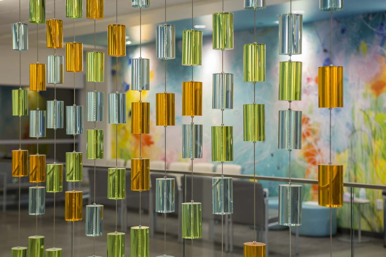
In addition to the wallcoverings, Baglien designed, fabricated and installed a 40’0”H x 13’0” W floor to ceiling sculpture in the main lobby. The sculpture is strings up through the 3-story stairwell and was created to encourage patients, visitors and staff to use the stairs for their health. This is an initiative of Kaiser Permanente’s #TotalHealthEnvironment. The sculpture, titled “The Falling Rain Wall” is fabricated of 365 hand-cast and hand-colored acrylic beads representing the days of the year. The beads are strung on 13 stainless steel cables and tensioned at the bottom. The beads, like raindrops, trickle down the 40’0” cables like rain on a spring day. More dense at the top and lighter at the bottom. The raindrops are colored to match the interior design created by #HMCARCHITECTS of Los Angeles, California and represent Oregon’s seasons - the orange of summer, the green of spring and the blue of winter. The entire sculpture is lit with 36 programmed LED lights at the top and bottom which light the sculpture with a feeling of rain pitter-pattering down softly and then stronger.

The entire sculpture is touchable yet cleanable and creates a sense of awe as one enters the lobby. Its height encourages people to look up in an almost church-like fashion to feel the expanse of the 3-story atrium and the stainglass-like sparkle of the raindrops cascading down the cables.

Falling Rain Wall sculpture schematic design.jpg
365 hand case acrylic raindrops, representing the days of the year, cascading down (13) 40'0" high stainless cables and lit with 36 LED lights programmed to ...

Hand painted watercolors are transformed in to wallcoverings and installed by the Studio Art Direct team.

Art designers Studio Art Direct curated and commissioned 375 works of art for this project including the 40 grid Songs From The Sky original encaustic paintings by local artist S.Freedman of Beaverton Oregon and large 48x96 custom paintings on each floor by local artist J. Lowe of Portland, Oregon

How to select the best artwork for healthcare

Kaiser Permanente Beaverton Medical and Dental Artwork.jpg

Art is what people remember. It’s what sparks discussion and gives people a true sense of place. From thousands of years ago when man began scrawling on the walls of caves, we have been wired to create visual beauty in our environments. In particular, the importance of artwork in healing environments is immeasurable.

New neuroscience research has proven that the right artwork can help people heal. Lowering blood pressure, reducing heart rates, providing a positive distraction, and stimulating the feel good hormones serotonin and oxytocin are some of the benefits of an art program selected to heal. In a stressful environment like healthcare, art, more the graphics, architecture or words, does heal.

But how do we judge what should and shouldn’t go into our art programs?

After 15 years of experience placing art in healthcare and studying the research, we have created an objective checklist that we use to validate our design decisions and take the subjectivity our of selecting artwork. The list was developed based on anecdotal and neuroscience research to help our art designers and clients determine the best artwork for certain patient populations and experiences and reflect their brand and mission. If you would like a copy of our checklist, please email janelle@studioartdirect.com

Art Program Strategy

Before we begin any new project, we have a meeting with all the stakeholders: design team including signage, interior designers, architects, lighting consultants, facilities, project managers, physicians, public relations representatives, and a community member. In this meeting we determine the main goals for the project. We discuss everything from artwork locations and integration into the building to brand mission and how to best meet patient population needs. Understanding, from the beginning of design, what problem you’re trying to solve and discussing how to approach solving that problem in a collaborative way is imperative in establishing a unified vision for the project.

Initial Art Location Map for confidential healthcare ancillary care building

Initial Art Location Map for confidential healthcare ancillary care building

Once we’ve determined our design vision, we break down the art program into main touchpoints – the main lobby, waiting areas, corridors, and exam rooms. We then visualize what the patient is experience when they walk through the building and have an appointment. Where are they spending the most amount of time? What departments are more stressful than others? And how can artwork be thoughtfully designed to improve the overall patient experience?

In addition to understanding the patient experience, our art programs are based on a theme and preliminary budget. We always design against a budget so we know where to spend and where to save. The artwork hierarchy and theme should be designed to relate to the patients and staff in the building. The material choices and regional artists we present are thoughtfully chosen based on the program goals, patient experience, and budget.   

Nature as Metaphor for Life

It has been scientifically proven that artwork depicting nature is healing for our mind, body, and soul. But what makes some artwork uplifting and others fall short? This is where the majority of our research in our go no-go list comes in.

Based on the composition, color, and content, we determine what artwork will represent life and health. When it comes to horizon line, we prefer something soft and linear to create a positive distraction for patients. For areas like mental health and blood draw, we typically try to balance sharp details and abstract blur to create interest but do not want any compositions that are disorienting or could cause vertigo.

Give your mind something to find in the artwork by balancing between abstraction and representational imagery.

Give your mind something to find in the artwork by balancing between abstraction and representational imagery.

Color palette should be of spring and summer – light blues and greens that are universally accepted across all cultures and religions and have been proven to reflect plentiful, healthy, growth. Depending on the patient experience, we will branch out into more vivid colors. We have found in geri-psych and OBGYN that bright, bold colors are very effective in creating positive emotions and narrative artworks help promote memory.

With regard to content, it is important to think what the artwork is trying to achieve. In physical therapy, we want to inspire people to make little steps toward regaining mobility for an more active lifestyle. Artworks that feature passive movement in nature such as a kayak or yoga are great for this. Another example is placing artwork with more of an education component in areas where patients families may be waiting for some time. Incorporating historical photographs and text is a great way to give families a positive way to pass time while they wait for loved ones.

While there are always exceptions to these rules, by following the basic principles of what has been proven to engage, transport, and delight, we can create more impactful healthcare facilities.

Regional Artwork Features

With every art program we design, we try and incorporate 100% regional artwork. Why? Because incorporating the local community supports regional artists and monetarily maximizes the impact of the art program on the community. At Studio Art Direct, we fabricate all of our artwork using local artists, framers and installers. Doing this is a great way to build support from the community for our clients. You don’t have to go overseas to get artwork and stock is not your only option.

By seeking out regional artists, we provide a variety of mediums that adds visual diversity to the building. Content is more relatable to visitors and staff because it depicts the region and represents the community. People also feel more at home and proud of the community they live in when an environment features regional artwork.

Nature On Screen Trending In Waiting Rooms

Nature On Screen Trending In Waiting Rooms

Studio Art Direct has made their nature video available for licensing! This beautiful cinematic video has been placed in healthcare facilities for healthcare waiting rooms and patient bedside monitors. Contact us today for information on licensing with us.

Read More

5 Large Art Installations & How They Were Created

5 Large Art Installations & How They Were Created

Art in architecture is a growing trend in healthcare, hospitality and government buildings.  It is the custom integration of art into casework, ceilings, floors, walls, glass and more. Here are 5 easy installation ideas and how they were created.

Read More